Below is the storyboard for my music video, it is best viewed in fullscreen.
Sunday, 20 November 2011
Friday, 18 November 2011
New ideas for my music video:
Here is the first few ideas for my music video:

(Click image to see a bigger version)
I understand that there will need to be a lot more shots needed for the music video, but this is just my initial ideas.
Changing my idea
Unfortunately, due to actors being unavailable and the storyline not quite fitting with the song, I've had to change my idea:
My new idea will only feature one character; a girl. The story of the music video will be a girl who's lost someone she loves (a boy), and she really misses him.
(currently scanning my new storyboard onto the computer, will be up in the next couple of days!)
My new idea will only feature one character; a girl. The story of the music video will be a girl who's lost someone she loves (a boy), and she really misses him.
(currently scanning my new storyboard onto the computer, will be up in the next couple of days!)
Tuesday, 15 November 2011
Song lyrics and ideas

(Click image to enlarge)
Above is my initial ideas for my music video.
I wanted to make sure the transitions between shots fitted in with the video as closely as possible, so I listened to the song as I made notes next to the lyrics.
Above is my initial ideas for my music video.
I wanted to make sure the transitions between shots fitted in with the video as closely as possible, so I listened to the song as I made notes next to the lyrics.
Friday, 11 November 2011
Brand Identity of my Music Video
1) What channel will you music video be shown on?
I think that my music video will be shown on channels such as NME and MTV. NME usually shows indie/acoustic music videos that appeal to a younger target audience, and MTV tends to show a wider range of music videos, usually aimed at a younger audience. I think showing my music video on these types of channels would help James Vincent McMorrow gain a lot more popularity, because the target audience is most likely to watch these types of channels.
2) What time/day will it be on?
I think MTV and NME would probably show my music video during the day/early evening. During these times the music channels tend to show slower videos, and during the evening they show more upbeat videos, because that's what appeals to the target audience.
3) How else might your audience access your music video?
The target audience may be able to access the music video through websites like YouTube and Vevo. Websites like these are a great way for artists to gain popularity because they can create their own profile for them to put all their music videos on. They can then advertise these videos on social networking sites such as Facebook and MySpace. Nowadays more and more people are using social networking sites, so they're a great way for artists to advertise their music, to gain more popularity and revenue.
4) How have you created a brand identity?
To create a brand identity, I have used the same fonts, house colours and the images in my magazine advert, CD cover/back, and music video. This makes sure that the artist and the album are easily recognisable to the audience, so they'll know exactly who it is when they see an advert in a magazine, or the CD in the shop.
5) How does your genre/ideology fit with that of the institution that you hope will broadcast your video/run your advert/stock your CD?
6) Have you done any research into these institutions? What have you found out?
7) Identify the links between your video, advert and digipack.
In the CD cover and the magazine advert I used images from the same photo shoot, this is because I wanted them to be similar so it creates a brand identity for the artist. Also, in my music video I have used shots of instruments, like guitars and pianos, so it creates even more of a brand identity.
8) Are there any differences? Why did you choose to do this?
I decided to give the CD cover/back a vintage style to it, so i changed the colours to sepia. However, I decided to make the music video different to this, I decided to change the colouring so it reflects the charaters' moods. For example, when they're happy I've decided to make the lighting brighter and more colourful, and when they have an argument the colours are a lot more dull, to reflect their unhappy mood.
9) Think back to the work you did on the music industry for your AS examination. Can you apply any of that knowledge to your A2 coursework?
10) How do you think the music industry is changing? How have you taken this into account in your coursework?
The music industry is very different to how it was a few years ago, for example, more people are downloading music online rather than buying actual CDs. Unfortunately, this has led to online piracy and illegal downloading. Sites like Piratebay and Isohunt offer people the oppotunity to download whole albums without any charge at all. This results in artists and industries missing out on important revenue
Tuesday, 1 November 2011
Music Video Ideas
Characters:
In my music video there won't be very many characters, you'll only really see the main characters; the girl and the boy.This means that the story between the two characters is emphasised.The idea of my video is to show how even though the characters are really different, they still manage to work, so the characters are going to have to be very different in appearance and behaviour. I intend to make them look very different from each other, so I have to give them very obviously different costumes:
Girl - The girl will be wearing very light colours. She will be wearing a light (maybe floral) dress, and a light coloured cardigan - so she looks very girly and the complete opposite to the boy.
Boy - I intend to make him wear very dark colours, so he contrasts with the girl to show just how different they are to each other. He will be wearing a black leather jacket, dark jeans and a dark t-shirt.
I thought I would keep it simple and not have very many characters in the video because that way it reflects the genre of music. Also, having too many characters in the video would take the focus off the couple and the storyline.
Lighting:
I will use lighting to represent how the characters in the video are feeling, for example, the video will be light when the characters are happy, and it will be darker when the characters are unhappy - This is to emphasise how the characters are feeling.
Settings/Locations:
Most of the settings I will be using are outside, except for when they go to the boy's house.
The settings/locations I am intending to use are:
- A pathway (for when the couple are walking along holding hands).
- A bench (for when there's the shot of the couple cuddled up together on the bench).
- A field/hill (for when the couple are laying down on the grass together).
- Outside some one's house.
- A hallway/stairs.
- A bedroom (this is where they have the argument, which results in one of them storming out).
Editing:
When the couple are happy together, I will edit the video so the transitions between shots are slower, to empasise their happiness. And when the couple have their argument, I will edit it so the transitions are faster to emphasise the angriness between the two characters.
Also, I will make sure that the transitions are faster when the song is more upbeat, and make them slower when the song is less upbeat.
Storyline & How it will relate to the theorists:
The storyline of my music video will fit in with Todorov's theory of music videos.
Todorov's theory is that the video will start off with the equilibrium, where every one's happy and is getting along. Then unfortunately something will come along to interrupt this equilibrium, so for example, an argument may happen, which results in someone trying to sort things out. Then everything gets sorted out and the characters reach the equilibrium, like at the beginning, again.
My music video fits in with this theory because it starts off with the couple being all happy and getting along with each other, then they end up having an argument over something, which results in one of them storming out. The boy sends the girl a text telling her to meet him, which is him trying to fix the problem. They both make up in the end, and they both reach the same equilibrium they were in at the beginning.
Tuesday, 25 October 2011
Music Video Research
'Lionheart' - Bury tomorrow
'Rolling in the Deep' - Adele
"Comin' Home" - City & Colour
From the research that I have done, I have concluded many things about the different conventions of music videos, depending on their genre. For example:
- Songs with a faster beat (heavy metal, hardcore, dance) tend to have faster camera movements and quicker transitions between shots in their videos. Slower songs tend to be the opposite of this, with slower camera movements and transitions. This is done so the video and shots fit with the beat of the song better.
- Faster and more upbeat songs tend to have transitions such as jump cuts, so they relate to the beat of the song. Slower songs tend to have transitions that fade in more. However, they do still use jump cuts, they just don't tend to have as many of them, and the shots are a lot longer.
Wednesday, 5 October 2011
Magazine Advert Evaluation
(Click on the middle of the slide for the writing to pop up on each slide, not the arrows!)
Friday, 30 September 2011
Magazine Advert Design
This is the flatplan of what I would like my music magazine advert to look like:

And here is my final music magazine advert design:

As you can see I have decided to keep the layout and colours of my magazine advert quite simple, this is so it represents the genre effectively. Acoustic/folk music is a very simple genre of music, so this is why I feel my magazine advert reflects that as well. Like I did with my CD cover, I tried to keep with the vintage/sepia style for my images; this is because I wanted to make them seem more 'natural' and less vibrant, like the artist's music. I wanted to make the magazine advert look sophisticated and mature, so it fits in with the sort of magazine it might appear in (for example, Q or NME), and so it represents the genre effectively.
Thursday, 29 September 2011
Magazine Advert Images
For my magazine advert I have decided to use the same images from the photo shoot that I did for my CD cover - this way the images fit together better and look more similar, to help give the album a brand identity because people will be able to recognise it easily.
To see the images that I intend to use, please look back at the post named 'CD Cover Images'.
To see the images that I intend to use, please look back at the post named 'CD Cover Images'.
Monday, 26 September 2011
Evaluation of CD Cover
How has the research helped me in my final product?
My research has helped me gain an understanding of all the main conventions of a CD cover, for example, where the artist/band name usually goes, and the fact that there's nearly always a main image in the background which takes up the whole cover. The research has helped me gain an understanding of how a CD cover should be laid out, depending on what genre the artist is.
Doing this taask had also helped me develop more knowledge of the genre conventions; what colours, fonts and layouts to use when designing an advert that advertises a certain genre of music, so it appeals to the target audience.
How my CD cover fits into the conventions of the genre:
The images are of the instruments that acoustic/folk artists usually tend to use (acoustic guitar and piano). Images like this show the fact that James Vincent McMorrow is a acoustic/folk artist. Also, a lot of folk artists use close ups of instruments to emphasise the instruments they use, and to represent the fact that they're an acoustic/folk artist.
How my CD cover appeals to the target audience:
There's lots of different close ups of the instruments, which makes it more interesting than just an ordinary image of an acoustic guitar. The scrapbook effect makes it more interesting and eye catching.
The editing process:
I used Photoshop CS2 to edit all of the images on the cover. First of all I changed the colouring of the images to give it a sepia/vintage look, so it would fit in with the genre conventions. I then inserted all of the images onto the background, making sure they overlapped slightly, creating a scrapbook effect. I chose the font which I thought would look best, and that fitted the conventions of the genre. Then I inserted all the text (the album title and the artist's name) in a new layer on top of the images.
What went well and what could have been better:
I think the images that I took worked really well, because they fit in with the genre characteristics. The close ups of the instruments make the images so much more interesting, and represents exactly the kind of artist James Vincent McMorrow is.
To make the CD cover better, I would make the font a little bit different, it looks too plain and out of place. I would maybe try and find a font that goes with the images a bit more, and isn't so bold. I would also change the colour of the font slightly so it blended in more with the rest of the cover.
What I have learnt from this and how that will help me in my next task:
From doing this task I have:
- Enhanced my editing skills on Photoshop . Before this task I never knew how to make images have a sepia/vintage look, but doing this task helped me gain knowledge of how to do that.
- Learnt the conventions of a CD cover, and the conventions of acoustic/folk music.
- Learnt a lot about the young acoustic/folk target audience, and what appeals to them.
Thursday, 22 September 2011
CD Cover Deisgn
Here is the design of what my CD cover will look like:

And here is the finished CD design:


Looking at my final CD cover design, you can see that I have changed the design a little bit more since my draft design. For example, I didn't put an image in the centre of the CD cover, this is because I felt like it looked too crowded and didn't represent the artist and genre of music. Acoustic/folk music is seen as a very simple genre of music, so I think that a simple design would represent this very well.
I wanted to give the images a vintage/sepia look, this makes them look very natural, and the lack of colour doesn't make it so loud and vibrant. The genre of music is very 'natural' and quiet, so I think the images help to represent the artist and genre very well.
Tuesday, 20 September 2011
CD Cover Images
These are the images I have taken to use for my CD cover. The artist I have chosen (James Vincent McMorrow) is an acoustic/folk artist, so I decided to do close ups of instruments that he would use, such as an acoustic guitar and a piano. This emphasises the type of artist he is, the genre of music he plays, and the instruments he uses.
I have edited a lot of the images that I am thinking of using so they are either black & white, and sepia/vintage. I have done this because if they were too colourful I don't think it would represent the genre of music very well. James Vincent McMorrow's music is very soft and quiet, so it wouldn't fit if I used loud and vibrant colours in my images on my CD cover.
Sunday, 11 September 2011
7) Artist and track I will be using
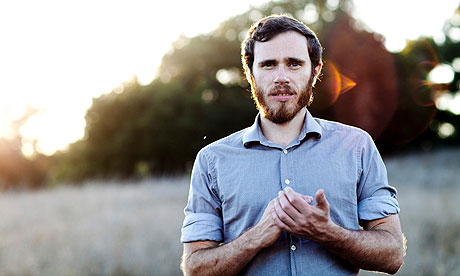 James Vincent McMorrow
The artist I have chosen to use is called James Vincent McMorrow; a successful acoustic/folk artist from Ireland.
He plays in lots of different venues to gain popularity, he even supported the famous acoustic/folk band City & Colour at the Royal Albert Hall in April 2011, which helped him gain the fame he deserved.

James uses the internet to promote his music; he has MySpace and Facebook pages, a website, and has music on Spotify and iTunes.

James uses the internet to promote his music; he has MySpace and Facebook pages, a website, and has music on Spotify and iTunes.

I will be using the song called "Sparrow And The Wolf" for my music video (see the video below). I chose this song because it's light and cheery, but also has a bit of an edge and darkness to it. I thought it would be a good song to use for my music video because I would also be able to give the video a bit of edge and character.
Thursday, 8 September 2011
Tuesday, 6 September 2011
Sunday, 4 September 2011
Wednesday, 31 August 2011
Tuesday, 30 August 2011
Wednesday, 20 July 2011
Video Remake Task - evaluating the exercise
Camera work - I have learnt about how important the tripod is in the filming of a music video. It's important because it helps to get clear, still shots of the subjects in the video, and it helps to get nice, smooth camera movement. Without a tripod, the shots aren't as smooth, and the camera will shake.
Tuesday, 28 June 2011
Coursework Brief
I have created this blog to record my A2 media coursework. We have to create a promotion package for the release of an album, to include a music promo video together with the following:
- A cover for its release as part of a digipak
- A magazine advertisement for the digipak
- A cover for its release as part of a digipak
- A magazine advertisement for the digipak
Subscribe to:
Comments (Atom)